HOPR
B R A N D I N G + D E S I G N
SUMMARY
HOPR is a design and animation studio in NYC that hired me to give them a head-to-toe rebrand and new website design. The brief for this project was to create a logo / id that was still recognizable as HOPR, but with a more simplistic and clean design approach. The original HOPR logo had some issues with legibility and felt dark and dated to their executive leadership. They wanted the new identity to have a sense of playfulness and opportunities to incorporate fun animation, while still staying professional and modern.
ORIGINAL LOGO
Problems: Legibility, Dated, Not versatile, only works over black
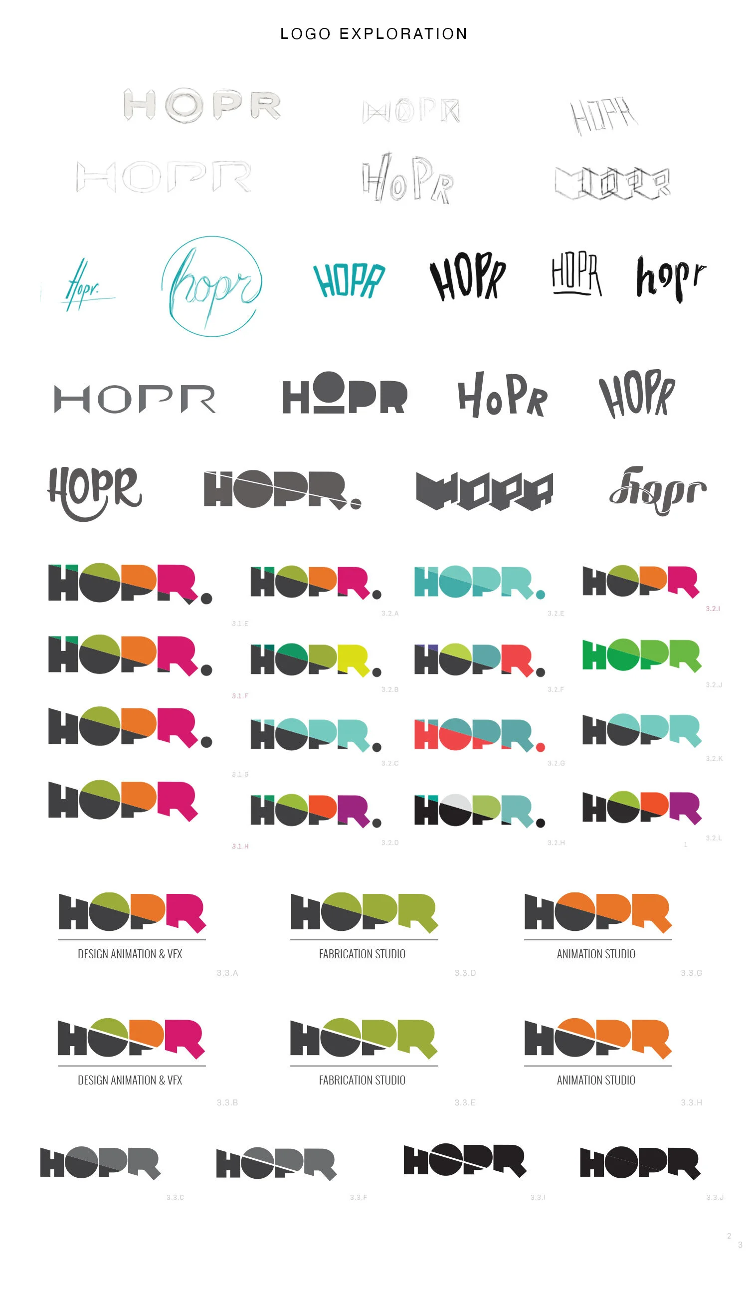
LOGO EXPLORATION
HOPR REBRAND
HOPR is a design and animation studio in NYC that hired me to give them a head-to-toe rebrand and new website design. The brief for this project was to create a logo / id that was still recognizable as HOPR, but with a more simplistic and clean design approach. The original HOPR logo had some issues with legibility and felt dark and dated to their executive leadership. They wanted the new identity to have a sense of playfulness and opportunities to incorporate fun animation, while still staying professional and modern.
UPDATED LOGO MARK GUIDELINES
FINAL LOGO


